Jump to content


Photo

Changing the Footscray Guernsey


  • Please log in to reply
24 replies to this topic

#1 StatsFanatic

StatsFanatic

    Wally Donald

  • Members
  • 7 posts

Posted 09 April 2010 - 09:08 PM

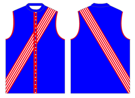
I realise Caveman is all for changing the jumper back the something like this:

Posted Image

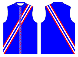
for a home jumper, and probably something like this -
Posted Image

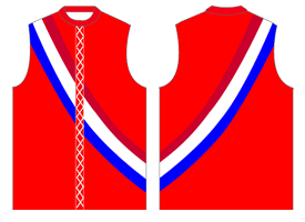
or this

Posted Image

for the clash jumper.

But I quite liked the 95-96 away jumper;

Posted Image

and I won't mind seeing it come back to the field, but looking something like this -

Posted Image


What would people think if the Bulldogs was to come out in the above jumper? Not as the actual home, but maybe the occasional non-clashing away game.

#2 PSP18

PSP18

    Wally Donald

  • Members
  • 21 posts

Posted 09 April 2010 - 11:34 PM

As far as away jumpers go I'm a massive fan of the current away one - aside from the 'yawning cat' it is smart, neat and does it job as a 'clash' jumper away to teams such as Melbourne and Carlton. Fashionably, it's not horrible for supporters to wear (I own one, but not a home jumper). Hopefully this will be retained.

The back of the jumper you came up with (the last one pictured) looks like a bikini bottom!

What do people think of clash uniforms in general? Traditionalists (most of us on this website) might point out that we didn't use them for 100 years but I don't mind them so long as they look neat. I prefer Collingwood's away jumper (worn tonight) to their home one although a lot of clubs' away uniforms are rubbish.

A website you might enjoy - http://www.footyjumpers.com/

#3 SonOfScray

SonOfScray

    Arthur 'Nance' Williams

  • Members
  • 49 posts
  • Gender:Male
  • Location:Map 28

Posted 09 April 2010 - 11:46 PM

I own the 96 away jumper, but it is horrid. The yawning cat andf that diamond shape are some nasty. dated concepts made up by guys with pinytails in Hawaiian shirts.

First half of the post says it all really. Would love to see us go the old tri colour strip, with white and red alternatives. Maybe a redesign of this jumper in the future:
Posted Image

#4 PSP18

PSP18

    Wally Donald

  • Members
  • 21 posts

Posted 09 April 2010 - 11:54 PM

Son Of Scray - that is Class with a capital C!

That away jumper would be magnificent.

Alternatively, how about plain white with a red and blue sash (about the width of Essendon's). This, coupled with white short and white socks (with a red and blue stripe halfway up the socks), would look great.

Shame my graphic design skills are poor... I'll leave the image for someone else or your imagination.

#5 StatsFanatic

StatsFanatic

    Wally Donald

  • Members
  • 7 posts

Posted 10 April 2010 - 12:25 AM

As far as away jumpers go I'm a massive fan of the current away one - aside from the 'yawning cat' it is smart, neat and does it job as a 'clash' jumper away to teams such as Melbourne and Carlton. Fashionably, it's not horrible for supporters to wear (I own one, but not a home jumper). Hopefully this will be retained.

The back of the jumper you came up with (the last one pictured) looks like a bikini bottom!

What do people think of clash uniforms in general? Traditionalists (most of us on this website) might point out that we didn't use them for 100 years but I don't mind them so long as they look neat. I prefer Collingwood's away jumper (worn tonight) to their home one although a lot of clubs' away uniforms are rubbish.

A website you might enjoy - http://www.footyjumpers.com/


I can see where your coming from, I mean the first three, I 'created' in Photoshop, and I would love to see the Bulldogs wearing it.

As for the 'bikini back bottom', I posted that jumper on another forum, and had that pointed out :lol: maybe it'd be better as an all blue back or as a straight white line at both ends of the red on the back.

With this website being of traditionalists, I could see why you would prefer Collingwood's away jumper over the current home, since the mainly white was originally the home.

And yes I'm aware of Mero's Footy Jumper site and it's an awesome site which I've checked a lot :(

I own the 96 away jumper, but it is horrid. The yawning cat andf that diamond shape are some nasty. dated concepts made up by guys with pinytails in Hawaiian shirts.

First half of the post says it all really. Would love to see us go the old tri colour strip, with white and red alternatives. Maybe a redesign of this jumper in the future:
Posted Image


I've seen an image of the '96 away in 'The History of the Footscray Football Club - Unleashed', and I can see how it would of been horrid, I mean in the image I noticed none of the jumpers exactly matched as the diamond shape was different on just about every guernsey. This would of probably been due to the fact it would of been hard to replicate as they were woollen jumpers at that stage. But seeing how we are at the age of printed guernseys now, it might look neater. And I'm not asking for every away game to have this 'diamond design' but a select few of only 2 or 3.

Son Of Scray - that is Class with a capital C!

That away jumper would be magnificent.

Alternatively, how about plain white with a red and blue sash (about the width of Essendon's). This, coupled with white short and white socks (with a red and blue stripe halfway up the socks), would look great.

Shame my graphic design skills are poor... I'll leave the image for someone else or your imagination.

I reckon I could have a go at designing what you're just explained there, I can see that pretty clear in my head right now.

#6 Caveman

Caveman

    Arthur Olliver

  • Root Admin
  • PipPipPipPipPipPipPipPipPip
  • 808 posts
  • Gender:Male
  • Location:Niddrie

Posted 10 April 2010 - 12:40 AM

As far as away jumpers go I'm a massive fan of the current away one - aside from the 'yawning cat' it is smart, neat and does it job as a 'clash' jumper away to teams such as Melbourne and Carlton. Fashionably, it's not horrible for supporters to wear (I own one, but not a home jumper). Hopefully this will be retained.

The back of the jumper you came up with (the last one pictured) looks like a bikini bottom!

What do people think of clash uniforms in general? Traditionalists (most of us on this website) might point out that we didn't use them for 100 years but I don't mind them so long as they look neat. I prefer Collingwood's away jumper (worn tonight) to their home one although a lot of clubs' away uniforms are rubbish.

A website you might enjoy -
http://www.footyjumpers.com/

Agree with everything you say here. I can tolerate an away uniform- if it is really necessary. Don't believe we need to wear one against the Eastern Tigers though, maybe tolerate it against the Central Demons, or the Southern Saints?

I didn't mind Collingwoood's jumper last night- I prefer that to their current home one with the black background. The one they wore in the 1970's was very good, that was Collingwoods best jumper along with what they had in the 1920's and 1930's. I also like St Kilda's current away guernsey- their 'vomit' jumper of a few years ago (that was St Kilda's fans description not mine) was a complete 'Barry Crocker'

Yes the current away guernsey for Western is quite good- yet the 'yawning cat' disqualifies it immediately. Sorry but I can never accept the image of Felix/Garfield/ having a stretch on our jumper. It is unnecessary and not appropriate for grown men. It would be fine for the little league kids at half time, but it does not belong on grown men.

I own the 96 away jumper, but it is horrid. The yawning cat and that diamond shape are some nasty. dated concepts made up by guys with ponytails in Hawaiian shirts.

Yes agree with you here too on that. Probably some bloke with a pony tail who doesn't follow football doing some arty farty course at uni dreamed that design up. No problem with that, accept that it was accepted and implemented! :lol:


Mero's footy jumpers site is a ripper- it is here in the BANNER LINKS.

#7 StatsFanatic

StatsFanatic

    Wally Donald

  • Members
  • 7 posts

Posted 10 April 2010 - 01:21 AM

Son Of Scray - that is Class with a capital C!

That away jumper would be magnificent.

Alternatively, how about plain white with a red and blue sash (about the width of Essendon's). This, coupled with white short and white socks (with a red and blue stripe halfway up the socks), would look great.

Shame my graphic design skills are poor... I'll leave the image for someone else or your imagination.


So something like this?

Posted Image

#8 PSP18

PSP18

    Wally Donald

  • Members
  • 21 posts

Posted 10 April 2010 - 01:39 AM

So something like this?

Posted Image


That's exactly what I've been thinking of!!

I reckon it'd look class.

#9 StatsFanatic

StatsFanatic

    Wally Donald

  • Members
  • 7 posts

Posted 10 April 2010 - 01:52 AM

That's exactly what I've been thinking of!!

I reckon it'd look class.

Yea, and it kinda brings back the early year back in the VFA when Footscray had a few sashed designs...

1894
Posted Image

1896
Posted Image

1898
Posted Image

#10 PSP18

PSP18

    Wally Donald

  • Members
  • 21 posts

Posted 10 April 2010 - 01:59 AM

The Dutch "clash" strip.....

Posted Image

I didn't realise it but that's where I might have got the inspiration from.

#11 StatsFanatic

StatsFanatic

    Wally Donald

  • Members
  • 7 posts

Posted 10 April 2010 - 02:02 AM

The Dutch "clash" strip.....

Posted Image

I didn't realise it but that's where I might have got the inspiration from.

Probably, but it still looks quite good as you/I set it out.

#12 Caveman

Caveman

    Arthur Olliver

  • Root Admin
  • PipPipPipPipPipPipPipPipPip
  • 808 posts
  • Gender:Male
  • Location:Niddrie

Posted 11 April 2010 - 08:38 AM

That's exactly what I've been thinking of!!

I reckon it'd look class.


Crystal Palace in England wore a similar guernsey in the early 1970's, with the sash. They beat Manchester United 5-1 with that at Selhurst Park, just after that Frank O'Farrell the Manchester United manager got the sack and they invited Tommy Docherty to take control. Then later on that decade- into the mid 1970's when Malcolm Allison took over as Crystal Palace manager, I believe it was he who had it changed to a Port Melbourne like jumper, that they have mainly worn since.

#13 DMcG

DMcG

    William 'Ching' Harris

  • Members
  • PipPipPip
  • 182 posts

Posted 12 April 2010 - 11:51 AM

I don't like the sash. Essendon wear a sash because they were founded by Freemasons. And Richmond wear a sash and really, who would want to be associated with them?

I like our away strip at the moment but I would prefer it if it was a full reversal of blue and white. The yawning cat should be blue I think.

#14 Caveman

Caveman

    Arthur Olliver

  • Root Admin
  • PipPipPipPipPipPipPipPipPip
  • 808 posts
  • Gender:Male
  • Location:Niddrie

Posted 12 April 2010 - 07:49 PM

South Melbourne used to wear a sash as well before World War 2. It is in Mero's Footy Jumpers website.

Their sash was a red one on a white background.

http://www.footyjumpers.com/

Posted Image


The soccer team River Plate in Argentina also wear a sash if I recall correctly?

As for yawning cats- they belong wholly with the 8 year olds primary school children running around in the little league at half time.

I like the old Richmond tiger logo- the one they had as their logo from the mid 1970's before they replaced it. However it would still look terrible on their guernsey.

Ditto the Melbourne pitchforked Transylvanian demon/dracula? logo. That is the best of the Mebourne logos, but it still should not appear on their senior jumper.

Yawning Cat- let Garry Hocking give Garfield/ Felix his tin of Whiskas and let him run off and play with a ball of knitting wool, before he has his stretch and yawn then falls asleep in front of the open fire.


#15 PSP18

PSP18

    Wally Donald

  • Members
  • 21 posts

Posted 12 April 2010 - 07:59 PM

South Melbourne used to wear a sash as well before World War 2. It is in Mero's Footy Jumpers website.

Their sash was a red one on a white background.

http://www.footyjumpers.com/

Posted Image


The soccer team River Plate in Argentina also wear a sash if I recall correctly?

As for yawning cats- they belong wholly with the 8 year olds primary school children running around in the little league at half time.

I like the old Richmond tiger logo- the one they had as their logo from the mid 1970's before they replaced it. However it would still look terrible on their guernsey.

Ditto the Melbourne pitchforked Transylvanian demon/dracula? logo. That is the best of the Mebourne logos, but it still should not appear on their senior jumper.

Yawning Cat- let Garry Hocking give Garfield/ Felix his tin of Whiskas and let him run off and play with a ball of knitting wool, before he has his stretch and yawn then falls asleep in front of the open fire.


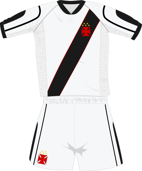
As do Vasco Da Gama in Brazil...

Posted Image

I don't think a sash is/should be unique to just Essendon and Richmond, as hoops aren't to Geelong and stripes aren't to North Melbourne, Collingwood and Hawthorn.

#16 SonOfScray

SonOfScray

    Arthur 'Nance' Williams

  • Members
  • 49 posts
  • Gender:Male
  • Location:Map 28

Posted 12 April 2010 - 08:58 PM

One of the Sunshine teams in the FDFL had red, white and blue in a St Kilda style strip which was good. The simple ones look the best. Yoke, stripes, sashes, hoops.

#17 Caveman

Caveman

    Arthur Olliver

  • Root Admin
  • PipPipPipPipPipPipPipPipPip
  • 808 posts
  • Gender:Male
  • Location:Niddrie

Posted 12 April 2010 - 08:59 PM

As do Vasco Da Gama in Brazil...

Posted Image

I don't think a sash is/should be unique to just Essendon and Richmond, as hoops aren't to Geelong and stripes aren't to North Melbourne, Collingwood and Hawthorn.


Yes I agree.

One distinctive guernsey was the one Middlesbrough had in the mid 1970's.That was the red shirt with the one white band in the middle. I believe it was Jack Charlton who brought that in when he became manager in 1973. That wasn't bad.

#18 Caveman

Caveman

    Arthur Olliver

  • Root Admin
  • PipPipPipPipPipPipPipPipPip
  • 808 posts
  • Gender:Male
  • Location:Niddrie

Posted 12 April 2010 - 09:11 PM

One of the Sunshine teams in the FDFL had red, white and blue in a St Kilda style strip which was good. The simple ones look the best. Yoke, stripes, sashes, hoops.


I would love it if he could be bothered/had the time (that is Mero) to do all the VFA guernsey's as a new hobby for his website

Some of those were beauties- Oakleigh had distinctive colours, Yarraville's jumper was a beauty as was the Sunshine one.

Mordialloc had red and white stripes, Caulfield was nicknamed the Bears- they had a Geelong like jumper though Caulfield's blue was a royal blue rather than a navy blue.

Northcote were green and gold, Prahran were the two blues.

What a tragedy that league (well that association!) just couldn't hold on- it was a real big deal in the early 1980's- South Melbourne moving to Sydney in 1982 began the demise of the VFA


#19 Lisbon

Lisbon

    Joe Marmo

  • Members
  • PipPipPipPip
  • 203 posts
  • Gender:Male
  • Location:Lisbon, Portugal

Posted 13 April 2010 - 04:49 AM

Re the Vasco da Gama sash, their original shirt was actually all black with white collar and cuffs. The sash (white on black or black on white, both are worn) was introduced in the 1930's when they were coached by a man that had previously coached River Plate and who was inspired by that club's kit. Many other soccer teams wear sashes, the most famous is Peru's national team (red sash on white).

As for Crystal Palace, they've recently reintroduced the sash, side by side with their "Port Melbourne" shirt. They've changed shirts a number of times, as you can check for yourselves - Posted Image

The 1969 to 1971 kit was a disaster - maroon and sky blue stripes with yellow collar and cuffs!

I don't mind teams wearing "clash" jumpers when facing teams with similar shirts. But I do mind the current "away shirt" trend that has teams changing shirts when at the drop of a hat, when it's not really necessary, just because nike's/ adidas'/ reebok's etc. commercial interests demand it. I remember a recent Portuguese soccer league game in which a team that plays in red shirts played away at a team that wears white ones. Stupidly, the visitors decided to wear their "cream" away kit, and in doing so managed to create a clash where none was before!

As Caveman posted, Footscray's jumper doesn't really clash with those of nearly all the AFL teams. So let's stick to the red-white-and-blue.

I wouldn't mind the revival of the white guernsey with one red and one blue stripe, as it's similar to the one worn by the "Allies" in the Escape to Victory movie. Footscray as the forces of good? It goes without saying.

As for the 96 kit, yawning cat and all, it reminds of "year of the Dogs", of Wallis, Liberatore, a young Chris Grant, Shaun Baxter battling against cancer, Peter Gordon, Jenny Hodgson and, of course, Danny Southern explaining just how he injured every joint and bone in his body, including his supposedly "good" knee...

#20 SonOfScray

SonOfScray

    Arthur 'Nance' Williams

  • Members
  • 49 posts
  • Gender:Male
  • Location:Map 28

Posted 13 April 2010 - 07:58 AM

Like quite a few of those Palace strips.

For me the name and the colours are the club not so much the design of the jumper. I think some people don't like to tinker with the jumper because they see that as most important. White jumpers seemed to be taboo because of umpire uniforms for instance.

I think all clubs should have a home, away and alternate strip - but only wear them for those purposes. IE wear the main jumper unless there is a clash.


1 user(s) are reading this topic

0 members, 1 guests, 0 anonymous users